
Aerial Canvas
We repositioned Aerial Canvas to reflect authority, precision, and premium performance in real estate marketing.
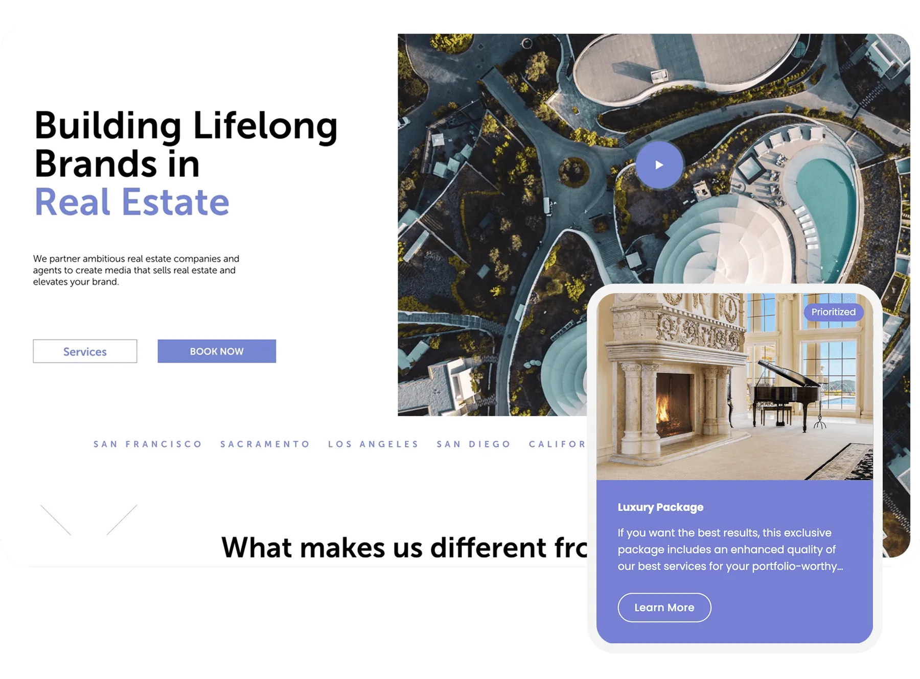
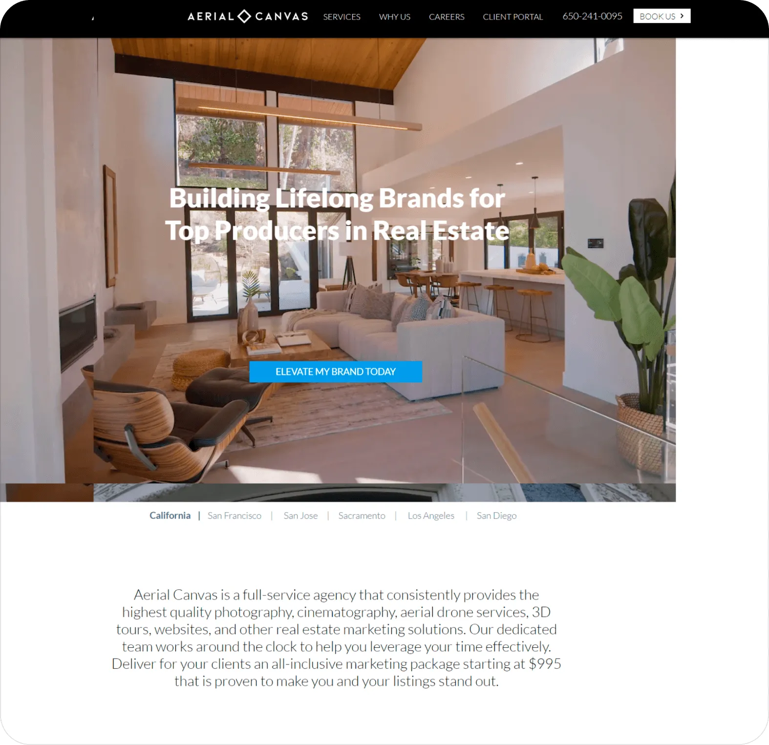
Aerial Canvas is a full-service real estate marketing agency serving top producers across competitive markets. However, their previous digital presence lacked the visual authority and strategic clarity required to position them as a premium partner in a saturated industry.
The messaging didn’t immediately communicate differentiation, and the user journey lacked structure, reducing engagement and conversion potential.
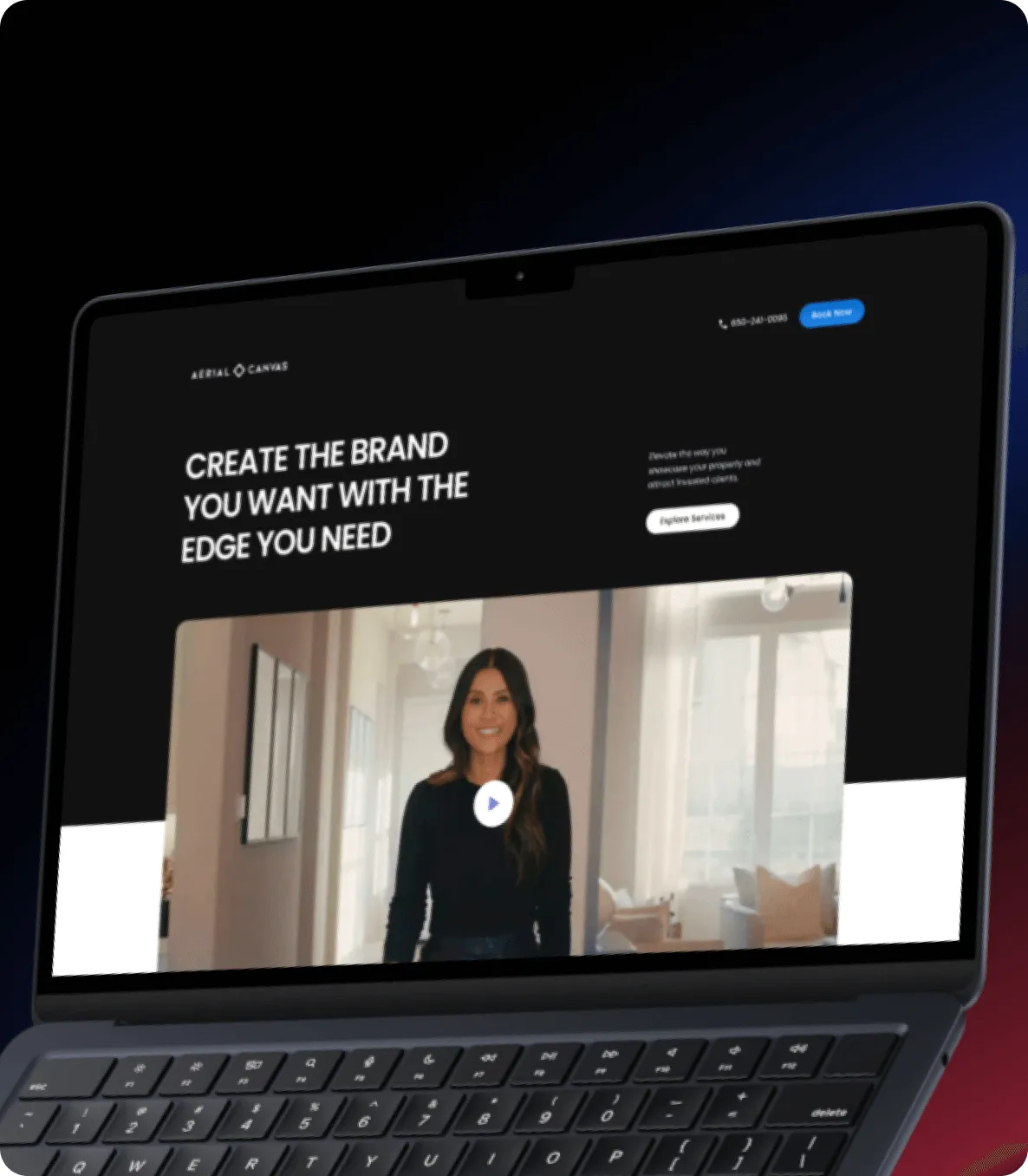
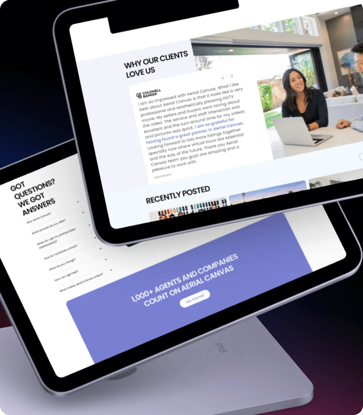
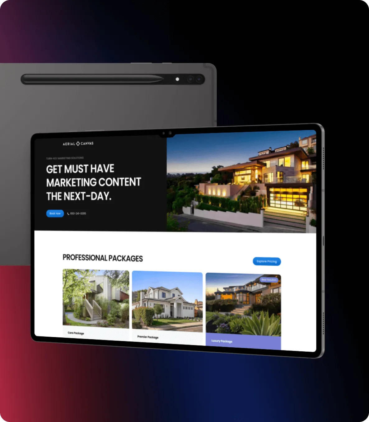
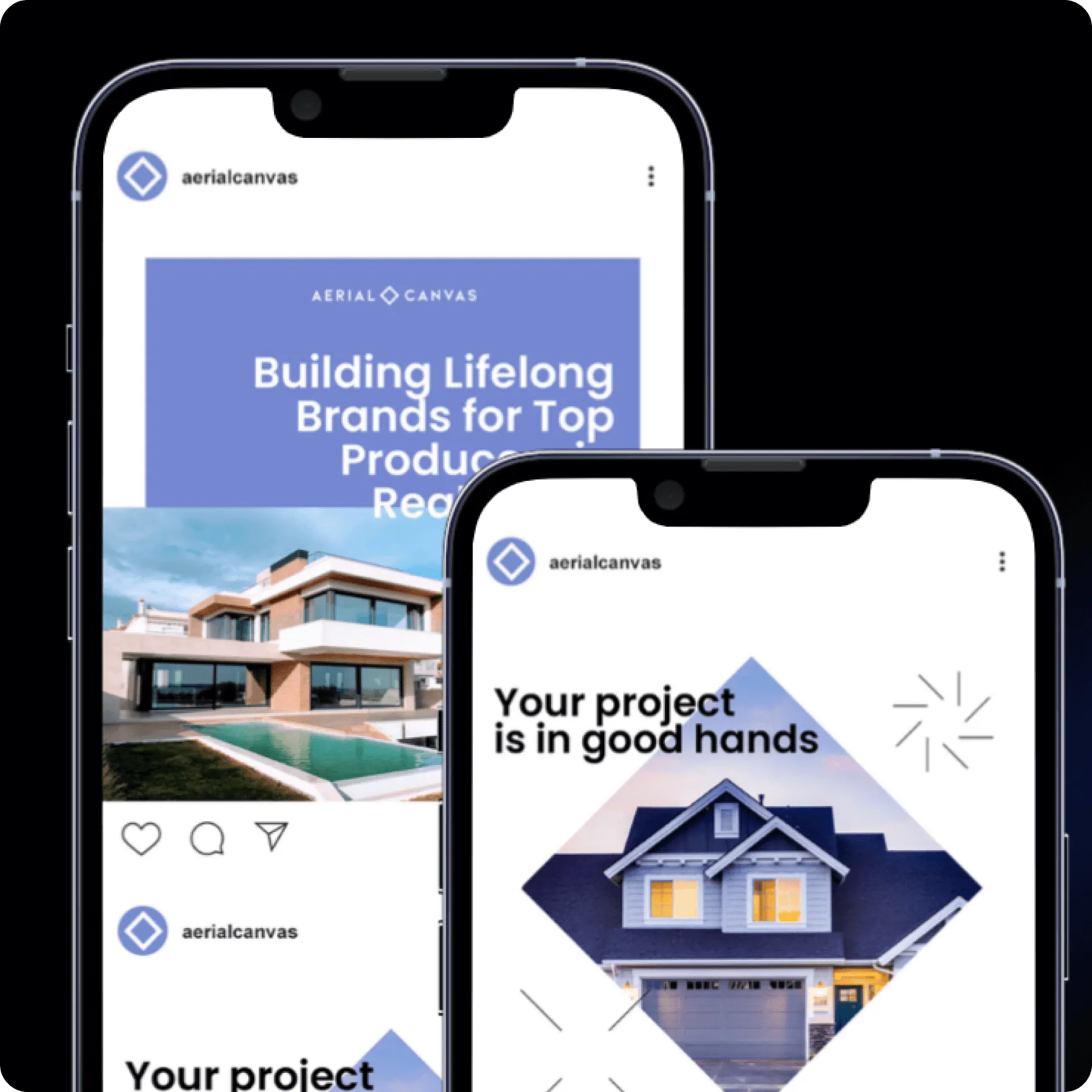
We introduced a high-contrast, confidence-driven visual system paired with clear, impact-focused messaging. Every section was intentionally structured to guide users from discovery to inquiry with precision. The result is a bold, conversion-optimized digital experience that positions Aerial Canvas as a modern leader in real estate marketing.
Process
Weak Brand Authority
The previous identity lacked the visual strength required to position Aerial Canvas as a premium service provider in a competitive market.
Unclear Value Proposition
Messaging did not immediately communicate differentiation, making it harder for high-level producers to recognize the agency’s true value.
Fragmented User Experience
The digital journey lacked structure and clarity, limiting engagement and reducing conversion potential.
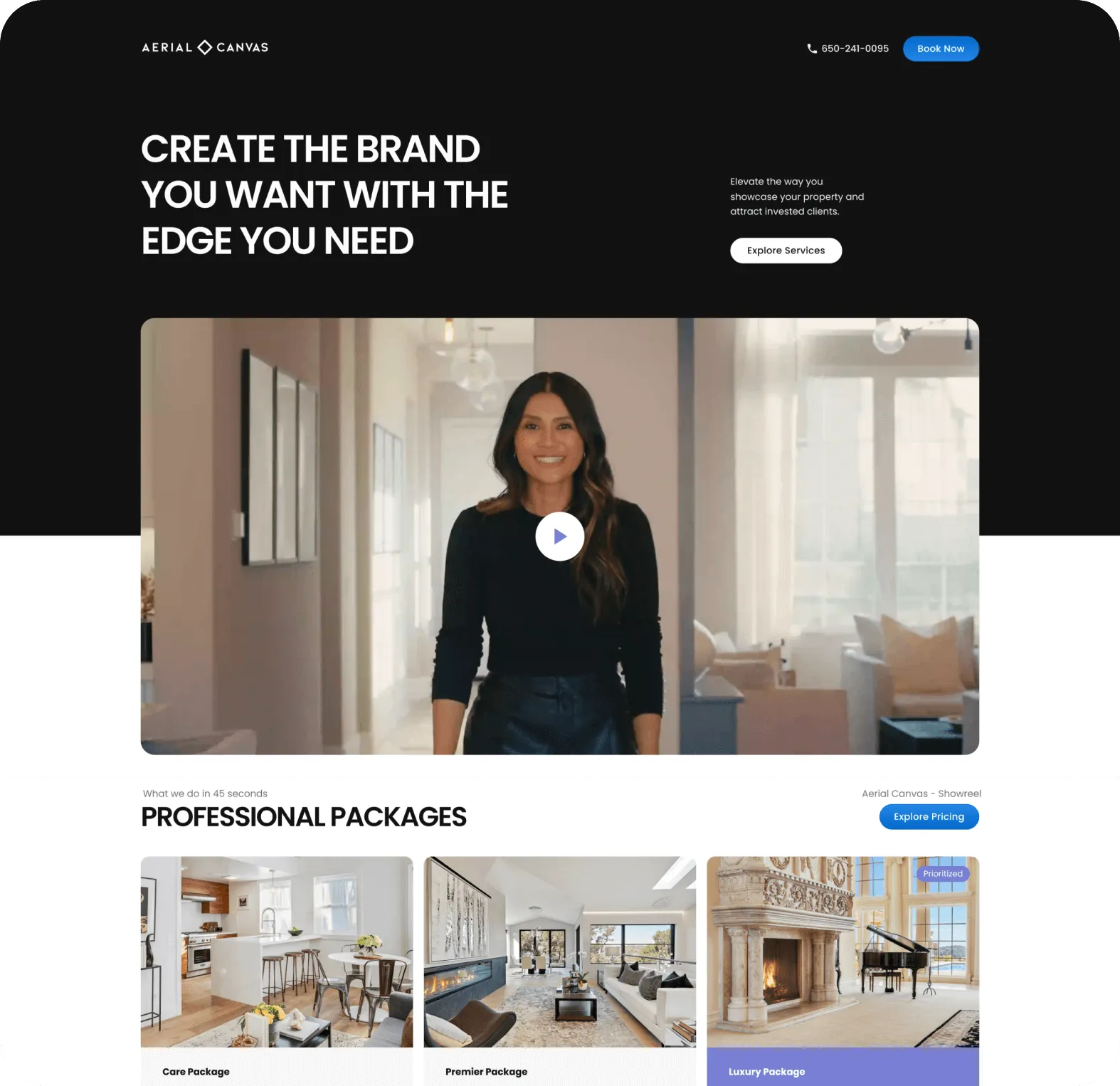
A Focused, Powerful Brand System
We introduced a bold, high-contrast visual language that reinforces clarity, precision, and confidence.
Clear, Impact-Driven Messaging
Every section was strategically crafted to highlight transformation and measurable outcomes.
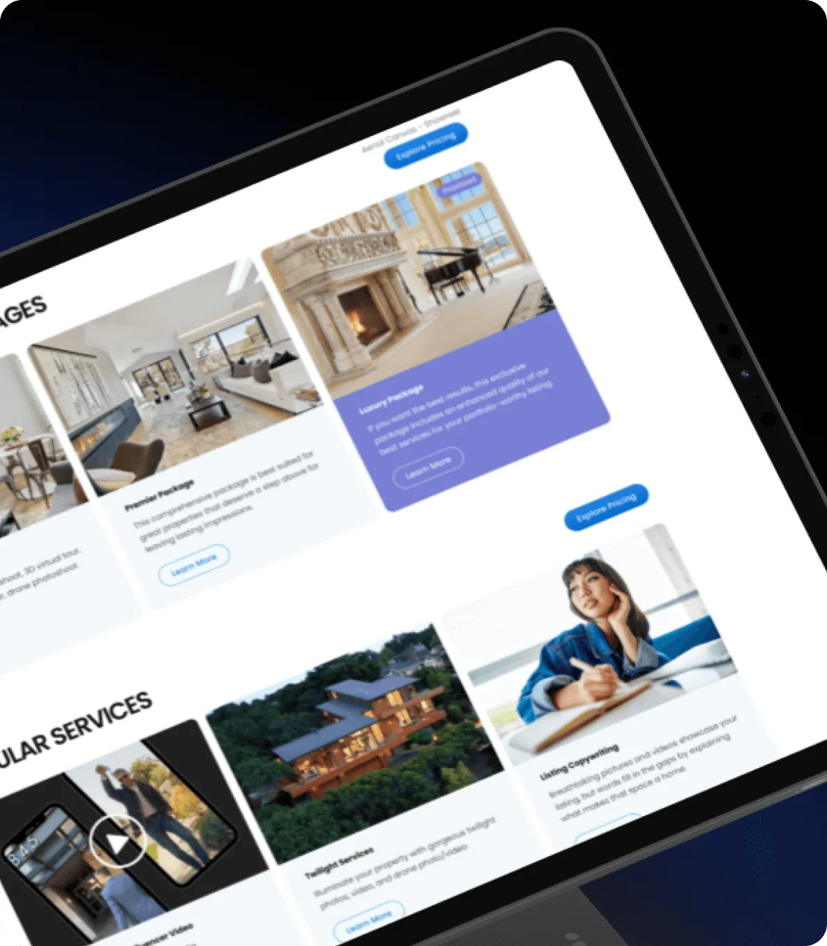
Structured User Journey
The redesigned experience intentionally guides visitors from discovery to inquiry — increasing clarity, engagement, and action.
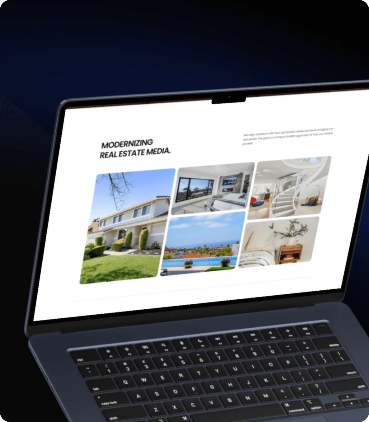
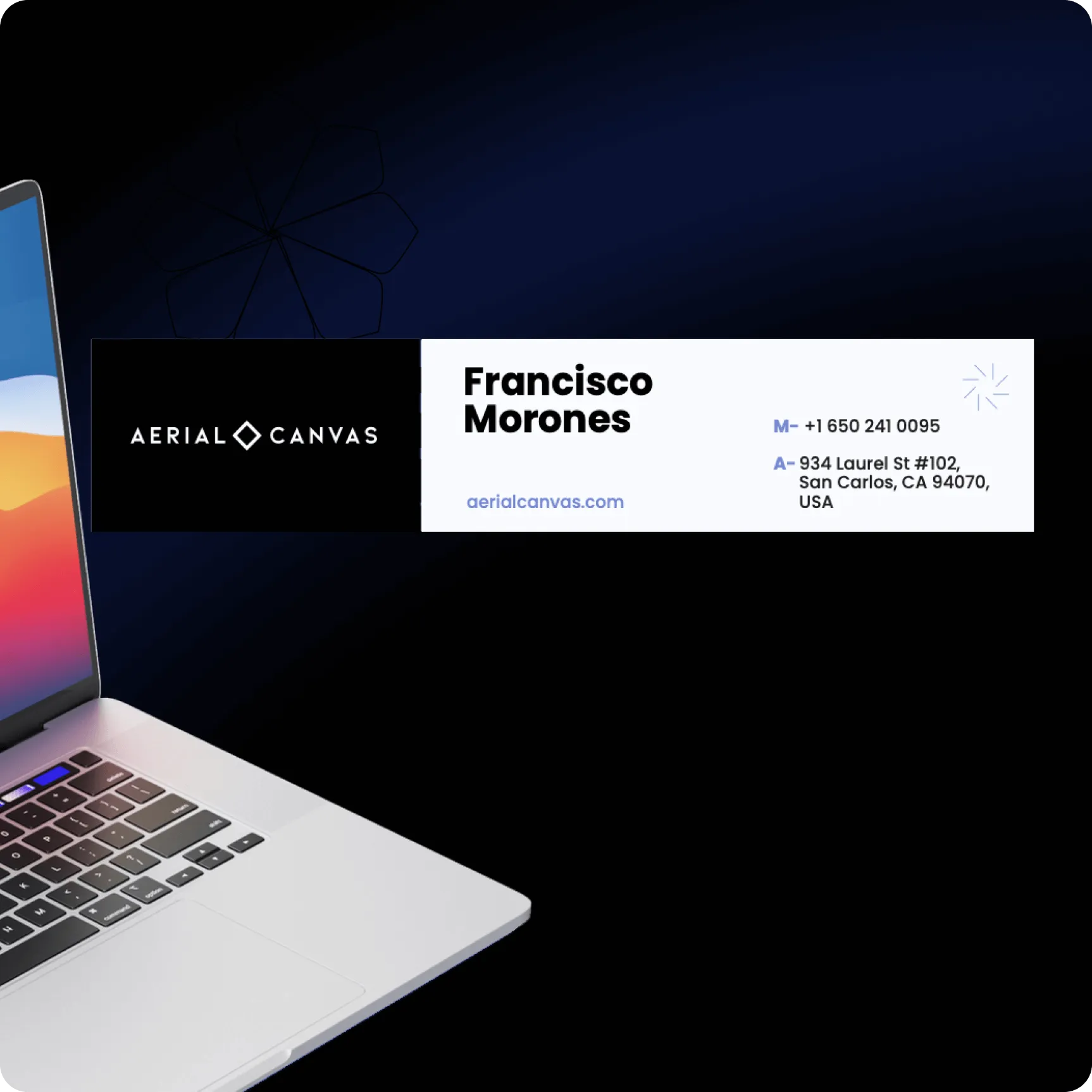
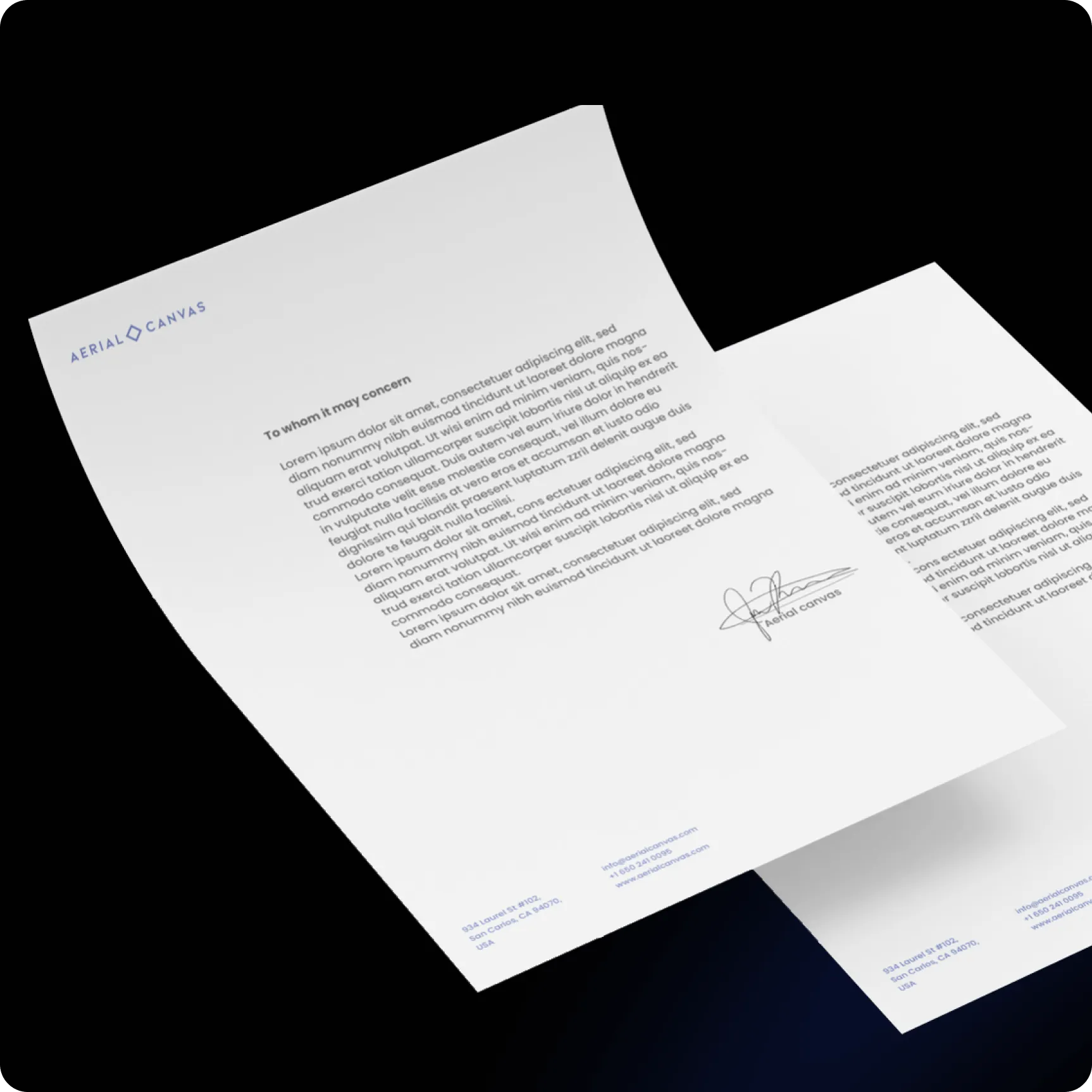
The digital experience balances minimalism with intensity — leveraging strong contrast, bold typography, and intentional spacing to communicate confidence and authority. Each interaction reinforces clarity, precision, and performance.
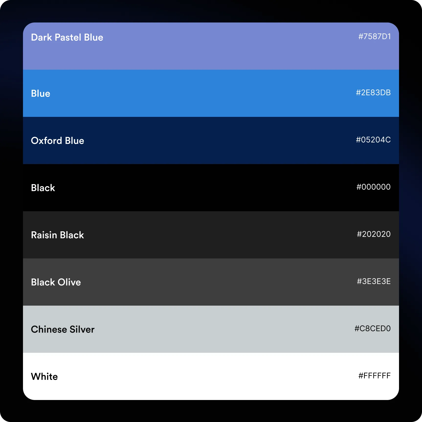
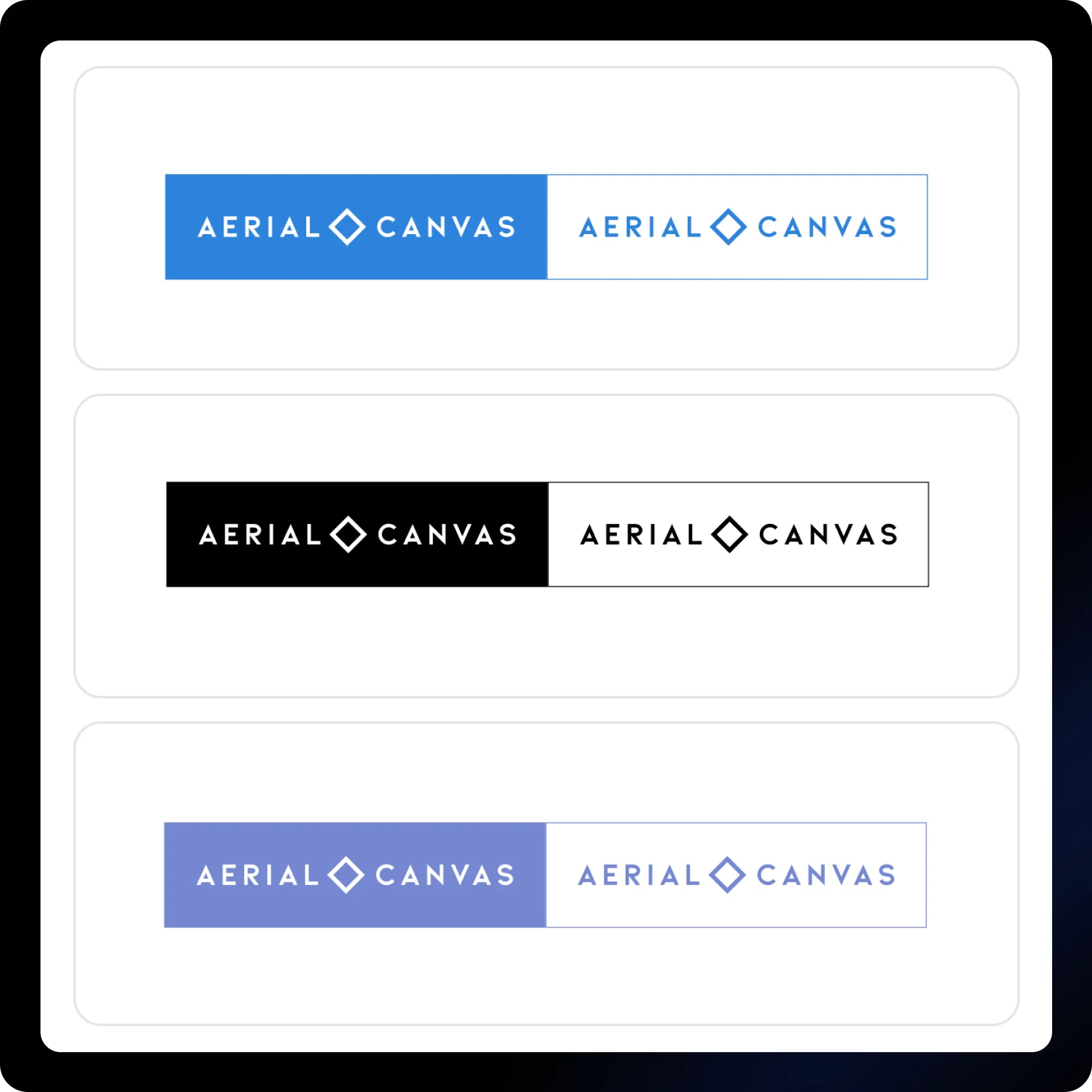
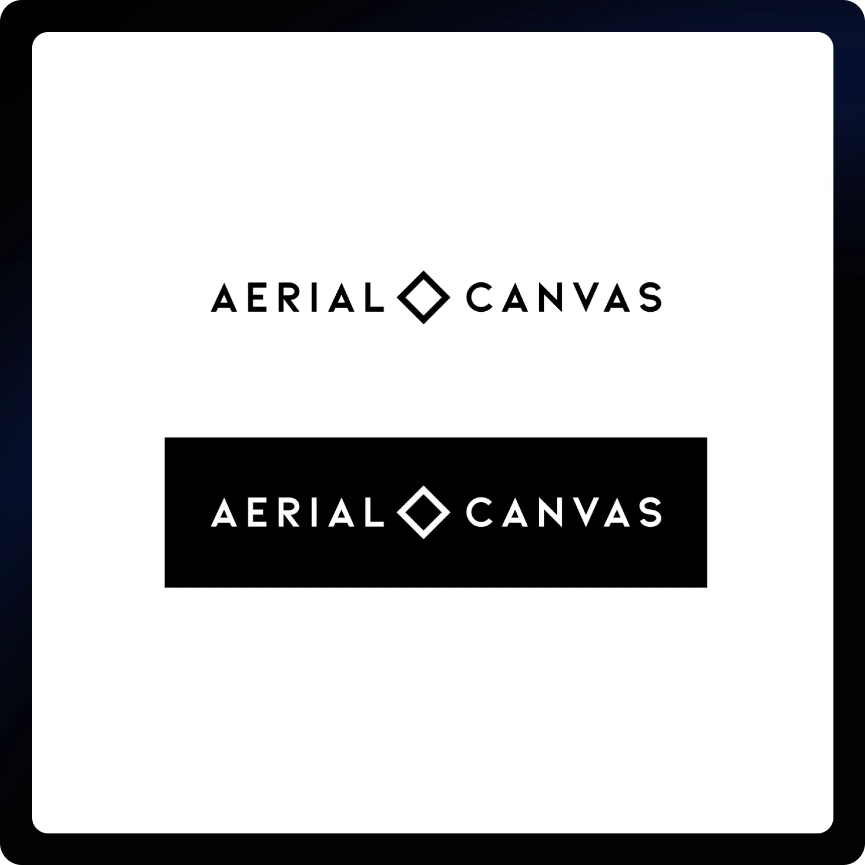
The identity is anchored in a disciplined blue spectrum — a balance of trust, professionalism, and performance.
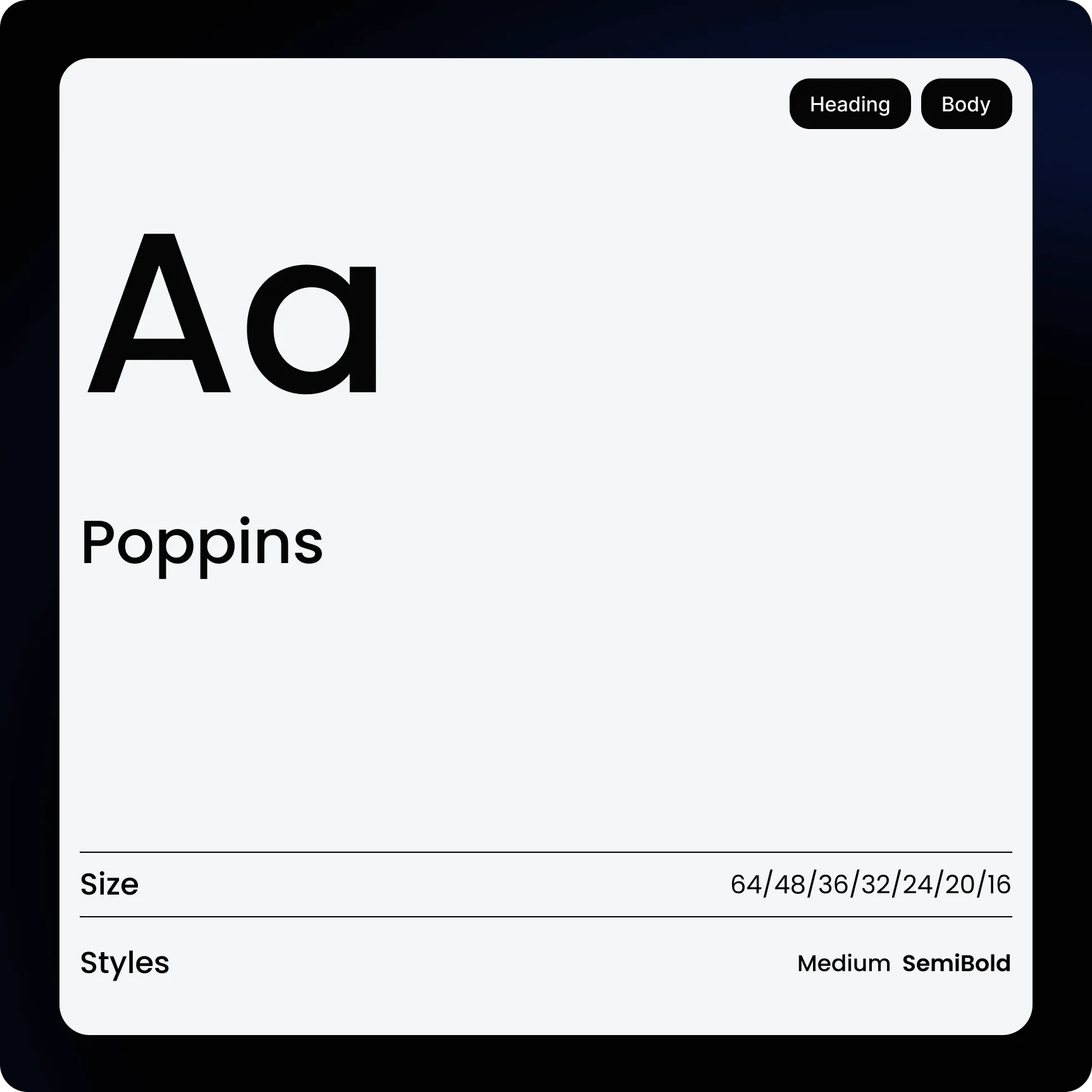
Poppins was selected for its geometric clarity and versatility, ensuring strong hierarchy and legibility across digital and print applications.
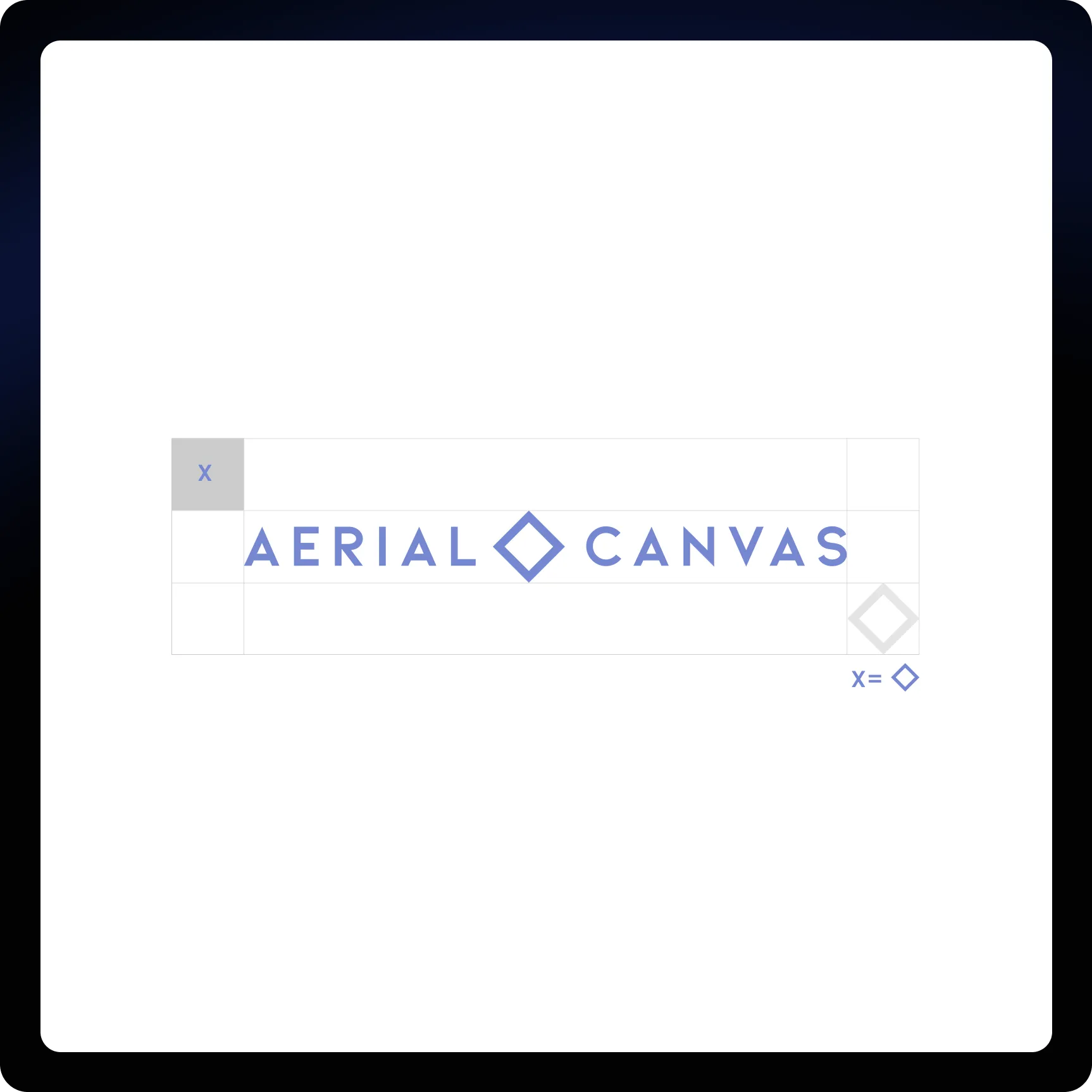
The diamond mark symbolizes structure and precision — core attributes behind Aerial Canvas’ commitment to excellence.

“Charly transformed the way our brand is presented online. The new website feels elevated, strategic, and perfectly aligned with the sophistication of the real estate market we serve.”