Ridge Point Safety
We partnered with Ridge Point Safety to build a strong digital presence that reflects authority, clarity, and trust within the workplace safety industry.
Ridge Point Safety required a cohesive brand and website experience capable of communicating professionalism and reliability while remaining accessible to its audience.
Our objective was to translate their expertise in workplace safety into a structured digital platform that reinforces credibility and simplifies user navigation.
Through strategic branding and web design, we delivered a refined online presence that strengthens perception and supports engagement.
Process
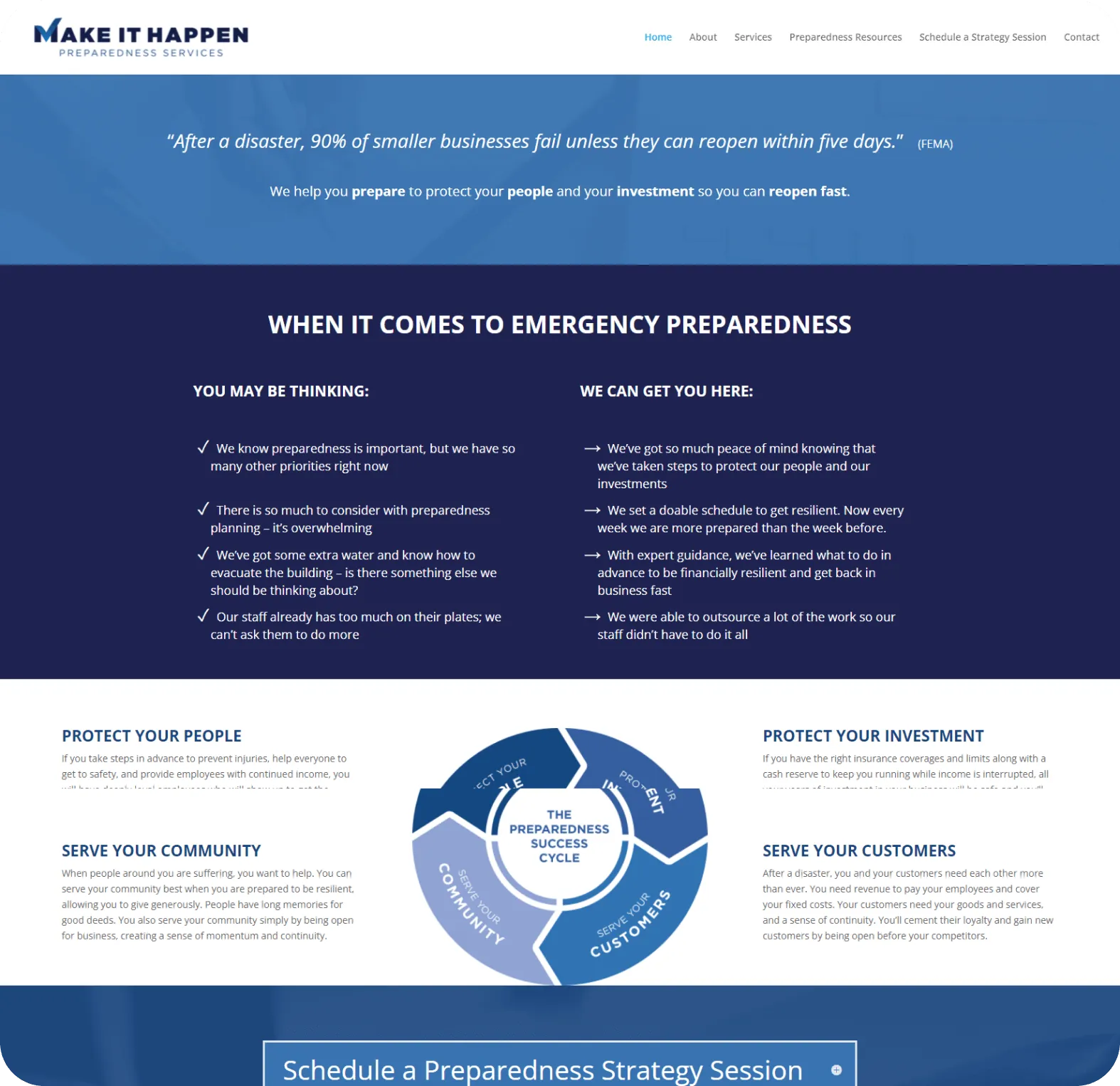
Brand Authority Needed Stronger Visual Expression
Ridge Point Safety had industry expertise, but its digital presence required a more defined visual identity to clearly communicate professionalism and trust.
Website Structure Lacked Clarity
There was an opportunity to improve information hierarchy and navigation to better guide users through services and safety solutions.
Inconsistent Digital Presentation
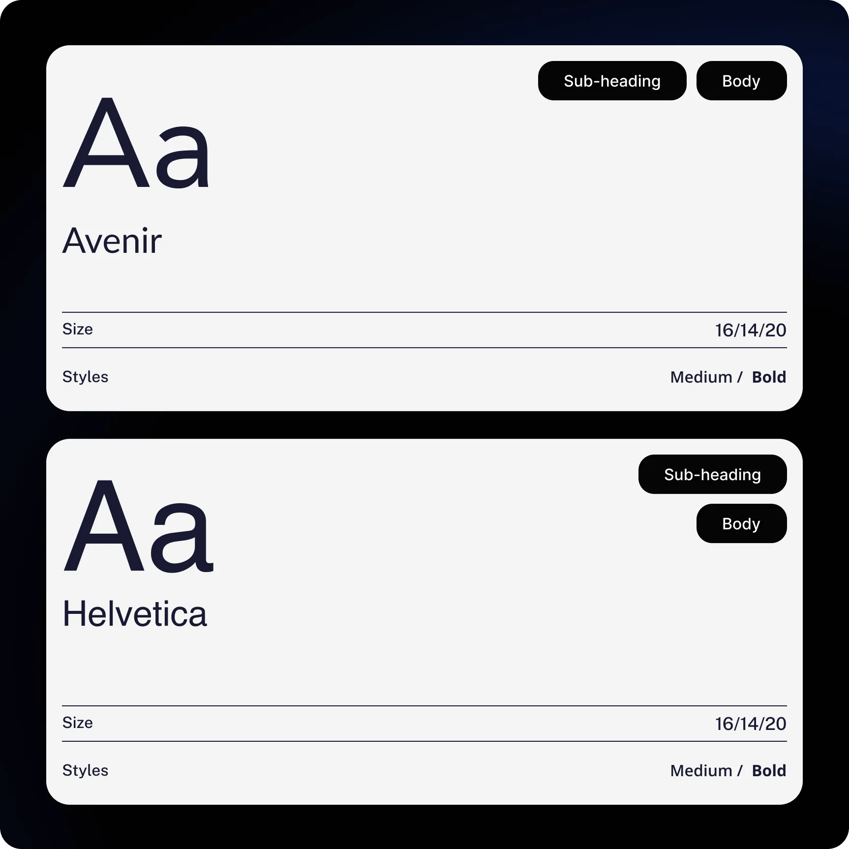
Typography, layout structure, and visual elements needed alignment to create a cohesive and scalable brand system.
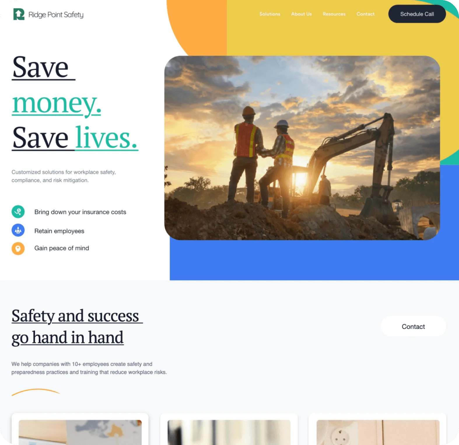
Refined & Professional Brand Identity
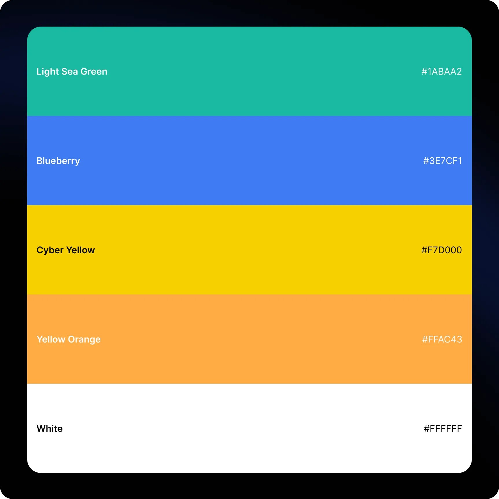
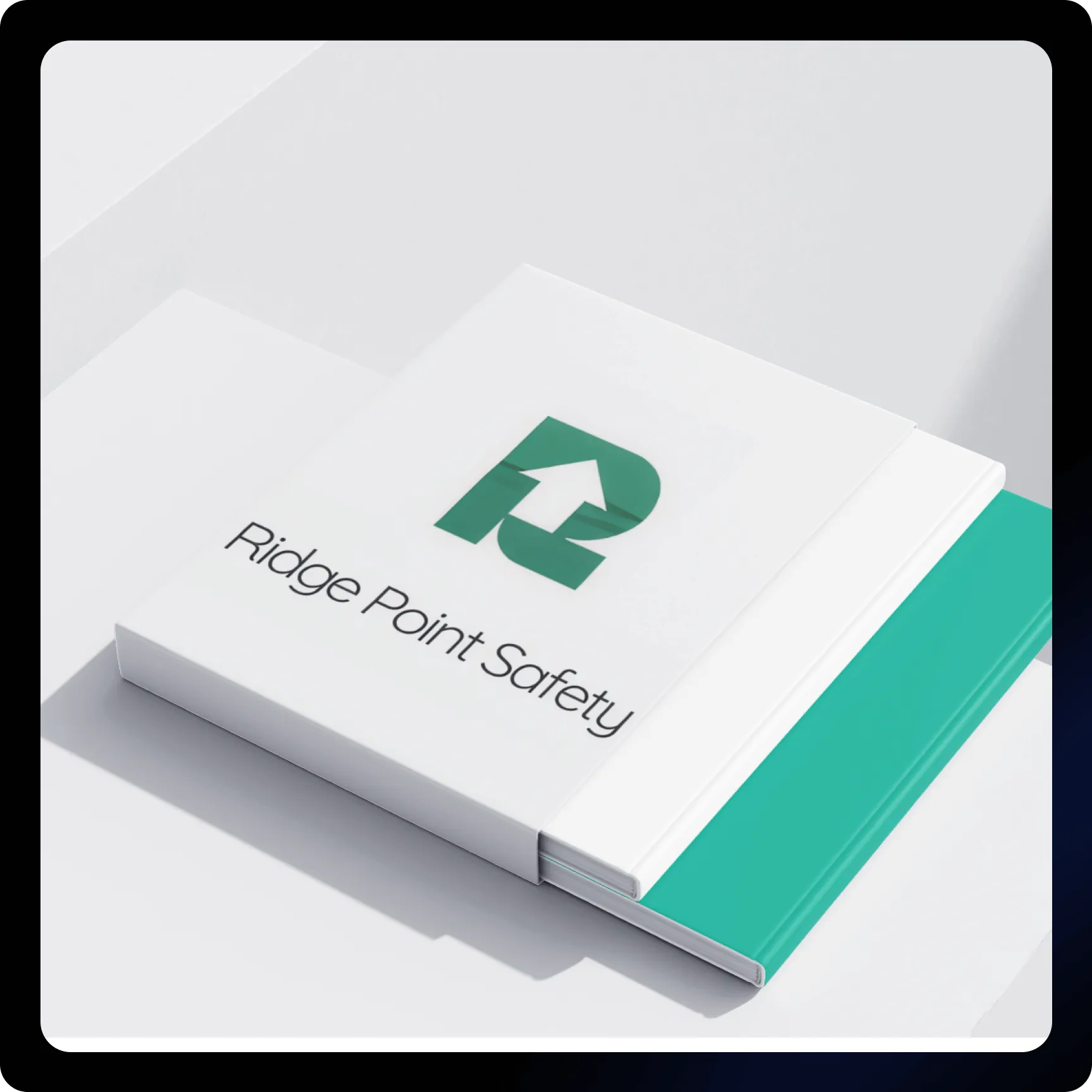
We developed a cohesive visual system that reinforces authority, clarity, and reliability within the workplace safety sector.
Structured & Intuitive Web Experience
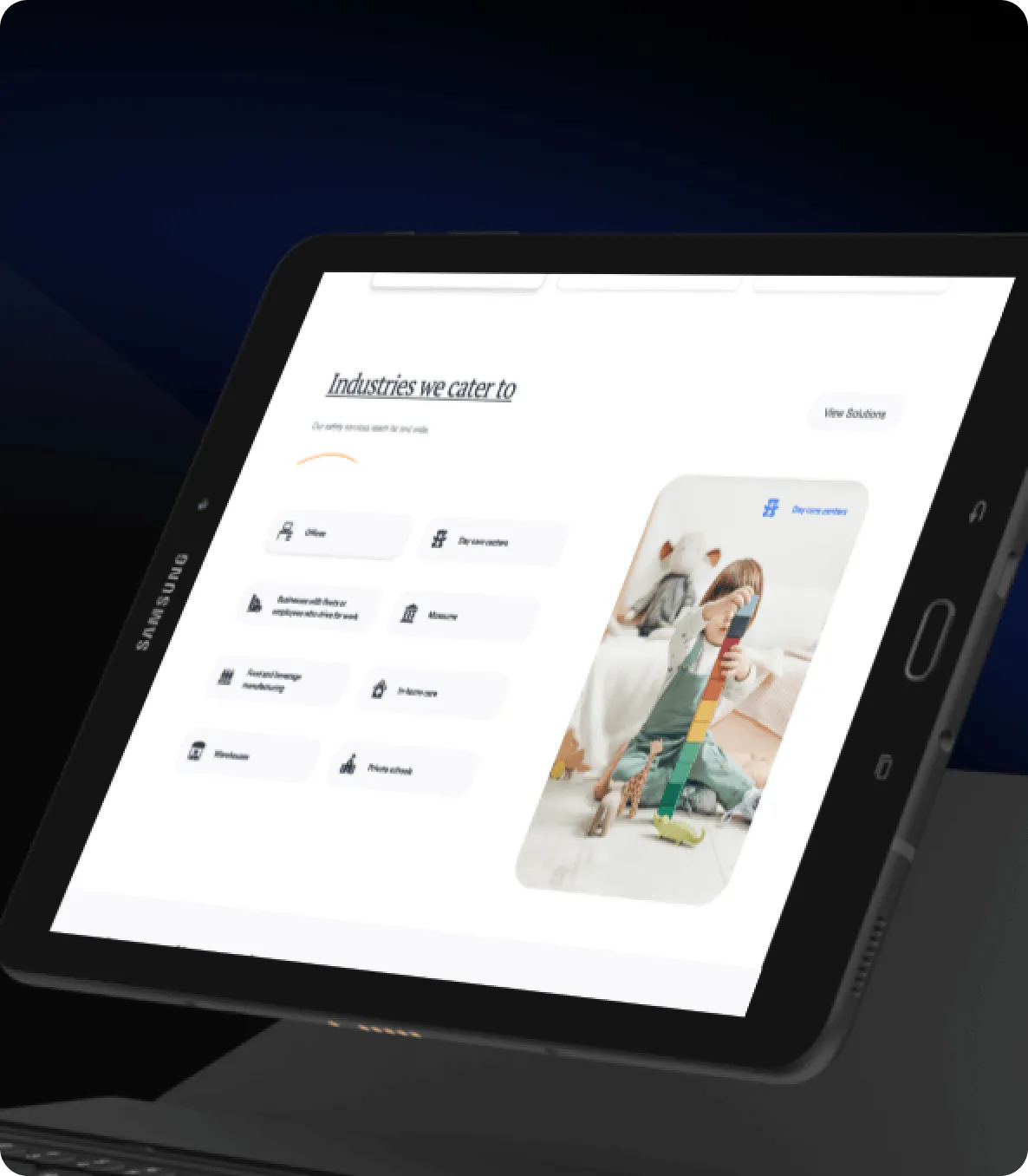
The redesigned platform prioritizes organized content architecture and seamless navigation, ensuring users can access information efficiently.
Consistent Digital Design Framework
Through unified typography, color application, and layout precision, we established a scalable system that strengthens brand recognition across touchpoints.
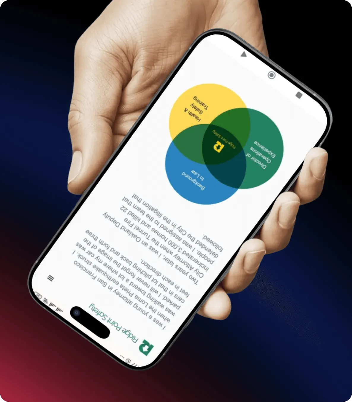
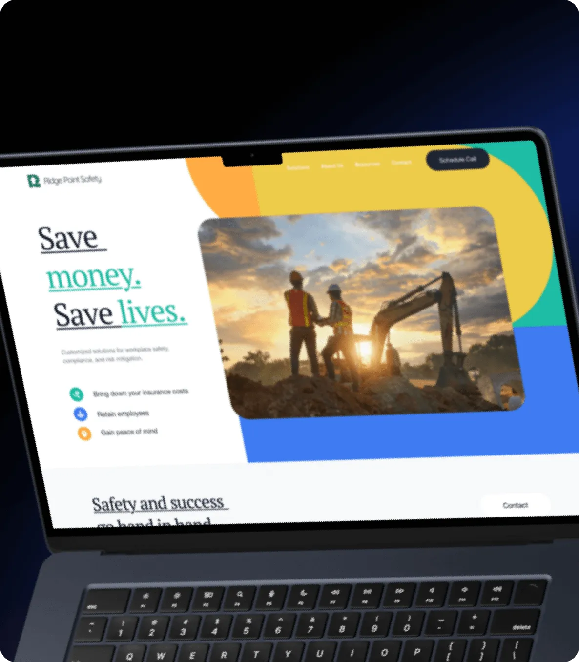
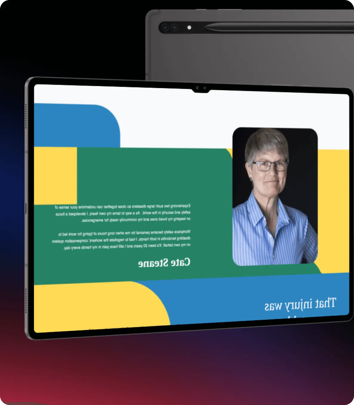
The Ridge Point Safety website was designed to communicate authority and professionalism through a clean, structured digital experience. By combining strong visual hierarchy with intuitive navigation, we created a platform that clearly presents services while maintaining accessibility and clarity. The cohesive design system reinforces trust and positions Ridge Point Safety as a reliable leader within the workplace safety industry.
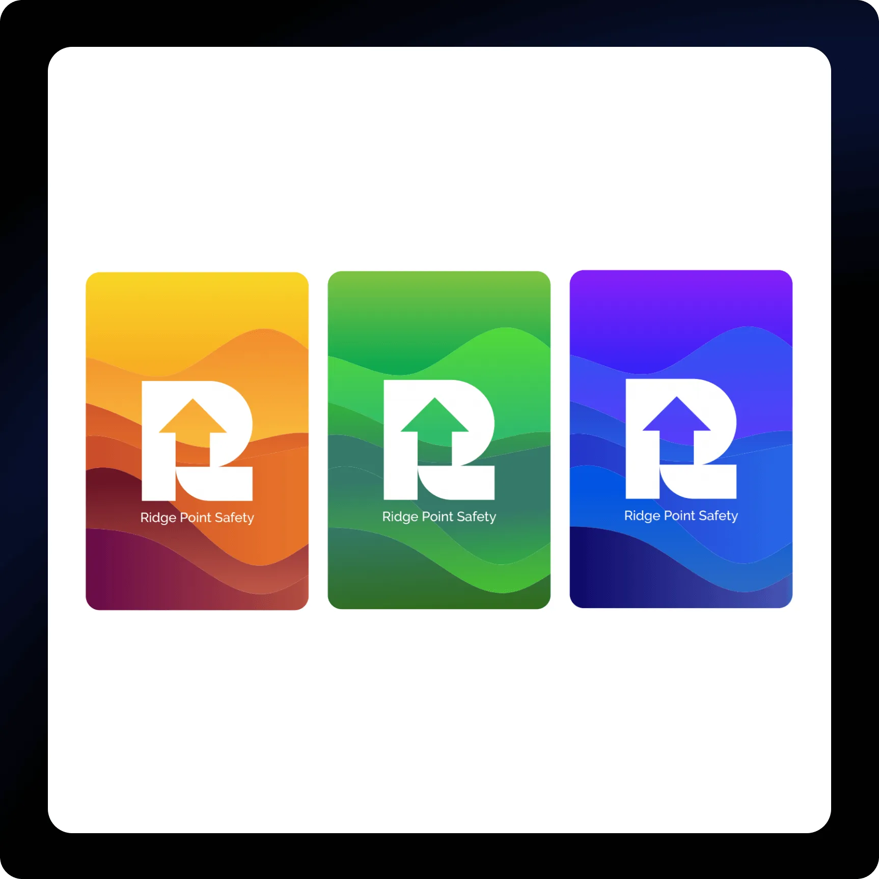
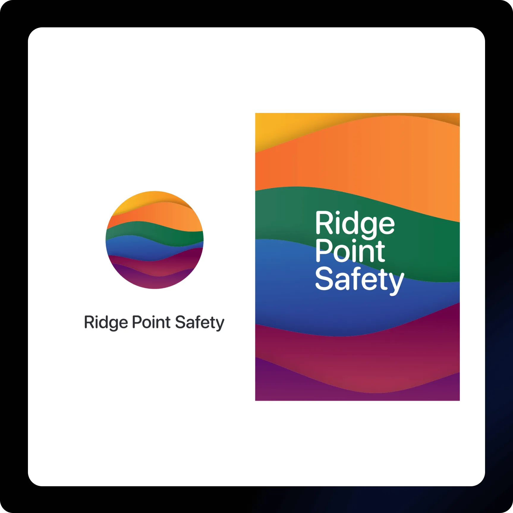
Through strategic branding and refined web design, Ridge Point Safety now communicates expertise and dependability with greater clarity. The cohesive visual system and structured digital framework elevate the brand’s presence while supporting a seamless and confident user experience.



“The redesigned website communicates our expertise with authority and clarity. The collaboration was smooth, and the final product truly elevated our digital presence.”

